
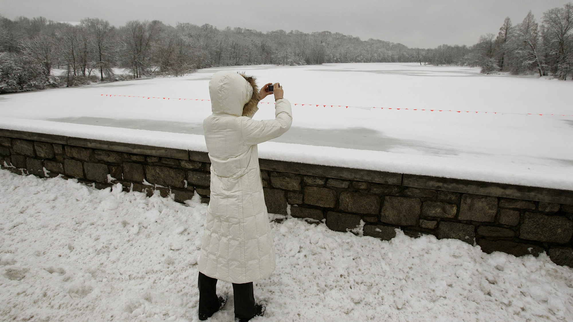
For much of the 20th century, winter brought an annual ritual to Princeton, New Jersey. Lake Carnegie froze solid, and skaters flocked to its glossy surface. These days, the ice is rarely thick enough to support anybody wearing skates, since Princeton’s winters have warmed about 4 degrees Fahrenheit since 1970. It’s a lost tradition that Grace Liu linked to the warming climate as an undergrad at Princeton University in 2020, interviewing longtime residents and digging through newspaper archives to create a record of the lake’s ice conditions.
“People definitely noticed that they were able to get out onto the lake less,” said Liu, who’s now a PhD student at Carnegie Mellon. “However, they didn’t necessarily connect this trend to climate change.”
When the university’s alumni magazine featured her research in the winter of 2021, the comment section was filled with wistful memories of skating under the moonlight, pushing past the crowds to play hockey, and drinking hot chocolate by the frozen lakeside. Liu began to wonder: Could this kind of direct, visceral loss make climate change feel more vivid to people?
That question sparked her study, recently published in the journal Nature Human Behavior, that came to a striking conclusion: Boiling down data into a binary — a stark this or that — can help break through apathy about climate change.
Liu worked with professors at Princeton to test how people responded to two different graphs. One showed winter temperatures of a fictional town gradually rising over time, while the other presented the same warming trend in a black-or-white manner: the lake either froze in any given year, or it didn’t. People who saw the second chart perceived climate change as causing more abrupt changes.
Both charts represent the same amount of winter warming, just presented differently. “We are not hoodwinking people,” said Rachit Dubey, a co-author of the study who’s now a professor of communications at the University of California, Los Angeles. “We are literally showing them the same trend, just in different formats.”
Both charts demonstrate the same warming trend, but the gradual temperature data is less striking than the binary lake data.
Winter temperature (°F)
Lake freeze status
The strong reaction to the black-or-white presentation held true over a series of experiments, even one where a trend line was placed over the scatter plot of temperatures to make the warming super clear. To ensure the results translated to the wider world, researchers also looked at how people reacted to actual data of lake freezing and temperature increases from towns in the U.S. and Europe and got the same results. “Psychology effects are sometimes fickle,” said Dubey, who’s researched cognitive science for a decade. “This is one of the cleanest effects we’ve ever seen.”
The findings suggest that if scientists want to increase public urgency around climate change, they should highlight clear, concrete shifts instead of slow-moving trends. That could include the loss of white Christmases or outdoor summer activities canceled because of wildfire smoke.
The metaphor of the “boiling frog” is sometimes used to describe how people fail to react to gradual changes in the climate. The idea is that if you put a frog in boiling water, it’ll immediately jump out. But if you put it in room-temperature water and slowly turn up the heat, the frog won’t realize the danger and will be boiled alive. Although real frogs are actually smart enough to hop out when water gets dangerously hot, the metaphor fits humans when it comes to climate change: People mentally adjust to temperature increases “disturbingly fast,” according to the study. Previous research has found that as the climate warms, people adjust their sense of what seems normal based on weather from the past two to eight years, a phenomenon known as “shifting baselines.”
Many scientists have held out hope that governments would finally act to cut fossil fuel emissions when a particularly devastating hurricane, heat wave, or flood made the effects of climate change undeniable. Last year, weather-related disasters caused more than $180 billion in damages in the United States, according to the National Oceanic and Atmospheric Administration. Yet climate change still hasn’t cracked into the ranks of what Americans say they’re most concerned about. Ahead of the 2024 election, a Gallup poll found that climate change ranked near the bottom of the list of 22 issues, well below the economy, terrorism, or health care.
“Tragedies will keep on escalating in the background, but it’s not happening fast enough for us to think, ‘OK, this is it. We need to just decisively stop everything we’re doing,’” Dubey said. “I think that’s an even bigger danger that we’re facing with climate change — that it never becomes the problem.”
One graph about lake-freezing data isn’t going to lead people to rank climate change as their top issue, of course. But Dubey thinks if people see compelling visuals more often, it could help keep the problem of climate change from fading out of their minds. Dubey’s study shows that there’s a cognitive reason why binary data resonates with people: It creates a mental illusion that the situation has changed suddenly, when it has actually changed gradually.
The importance of using data visualizations to get an idea across is often overlooked, according to Jennifer Marlon, a senior research scientist at the Yale Program on Climate Change Communication. “We know that [data visuals] can be powerful tools for communication, but they often miss their mark, partly because most scientists aren’t trained, despite the availability of many excellent resources,” Marlon said in an email. She said that binary visuals could be used to convey the urgency of addressing climate change, though using them tends to mean losing complexity and richness from the data.
Professor Ed Hawkins / University of Reading
The study’s findings don’t just apply to freezing lakes — global temperatures can be communicated in more stark ways. The popular “climate stripes” visual developed by Ed Hawkins, a professor at the University of Reading in the U.K., illustrates temperature changes with vertical bands of lines, where blue indicates cold years and red indicates warm ones. As the chart switches from deep blue to deep red, it communicates the warming trend on a more visceral level. The stripes simplify a gradual trend into a binary-style image that makes it easier to grasp. “Our study explains why the climate stripes is actually so popular and resonates with people,” Dubey said.
Source link
Kate Yoder grist.org